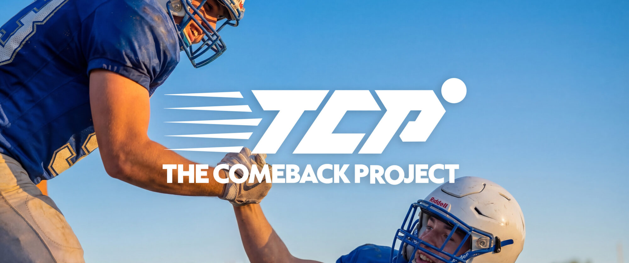
The Refinery created a brand style guide, visual identity system, logo assets, brand colors, typography, messaging direction, social guidance, merchandise applications, and full website design and build for The Comeback Project, a student-athlete recovery initiative helping injured athletes access free MRI scans within 72 hours.

The challenge
The Comeback Project needed a visual identity that could carry urgency, care, and forward momentum.
The initiative supports injured student-athletes and their families at a stressful moment: when an injury happens, X-rays may not provide enough detail, delayed diagnosis can slow recovery, and uncertainty can mean missed seasons, unnecessary worry, and harder decisions.
The Comeback Project’s goal is to provide MRI scans within 72 hours, free of charge, giving families clearer information and helping athletes move toward the right recovery plan faster.
The brand needed to feel athletic without becoming aggressive, credible without feeling clinical, and supportive without going soft. It also needed a practical system for the website, social content, partnerships, fundraising materials, events, merchandise, and future campaign applications.
The idea
The Refinery built The Comeback Project identity around motion, momentum, and the journey back.
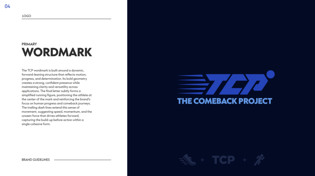
The TCP wordmark was designed to feel dynamic and forward-moving, with a structure that reflects progress and determination. The identity system used motion-inspired elements, logo variations, layered blues, neutral tones, and a clear typography system to create a brand that could feel athletic, human, and focused across many applications.
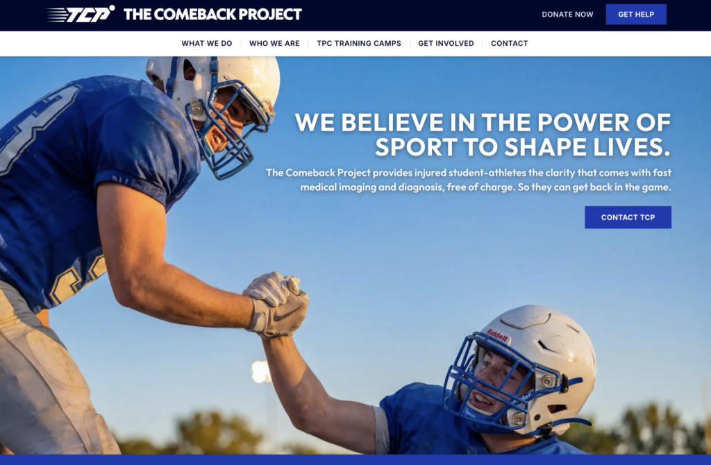
That same system extended into the website. The digital experience needed to explain the mission quickly: injured student-athletes need timely MRI access, families need clearer answers, and a faster diagnosis can help create a smarter path back.
The goal was not just to create a logo.
It was to build a visual and digital system that could support the full comeback story: the injury, the uncertainty, the scan, the diagnosis, the recovery plan, and the return to the field.
The result was an identity that did not just say comeback.
It looked like one.
What The Refinery made
Brand style guide
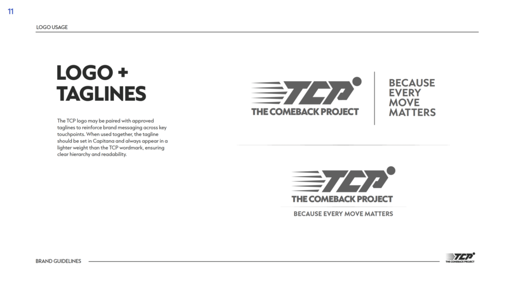
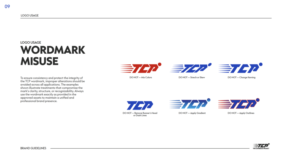
The Refinery created a brand style guide for The Comeback Project covering logo usage, typography, brand colors, messaging, social guidance, merchandise applications, and visual consistency.
Logo design and wordmark
The Refinery developed the TCP wordmark and logo system as a bold, motion-driven identity built around progress, student-athlete recovery, and forward momentum.
Logo assets and color variations
The Refinery delivered logo assets in the approved brand colors, giving The Comeback Project flexible options for dark, neutral, and light backgrounds while preserving legibility and recognition.
Iconmarks
The Refinery created iconmarks for compact applications including social avatars, badges, merchandise, digital placements, and small-format brand moments.
Typography and color system
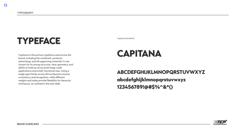
The Refinery established a typography system and color palette to support headings, body copy, brand materials, social content, merchandise, and website design.
Messaging direction
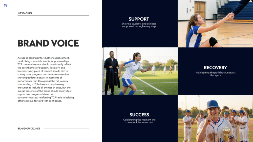
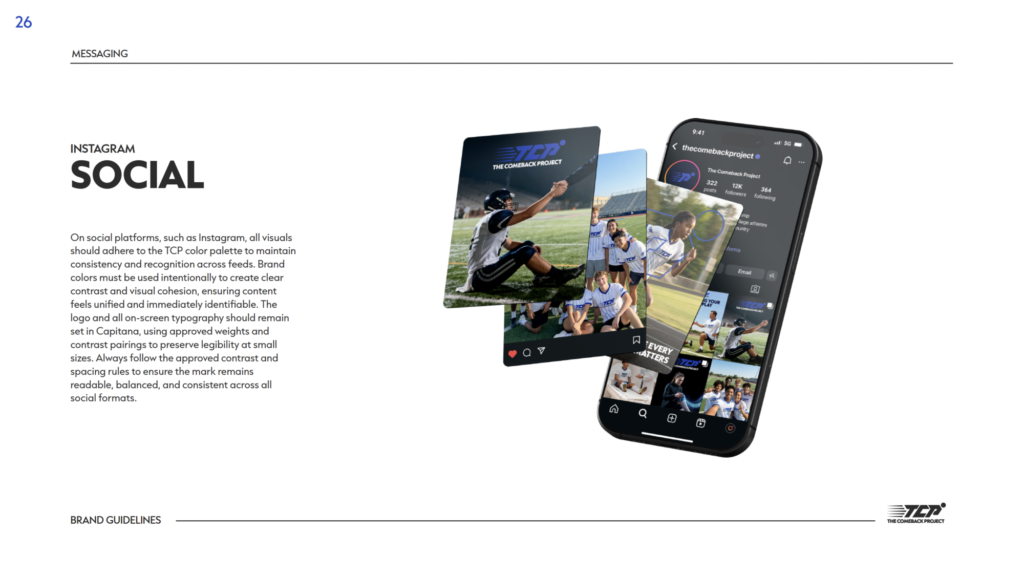
The style guide defined messaging around support, recovery, access, and progress, giving the brand a clear voice for student-athlete recovery storytelling.
Social media guidance
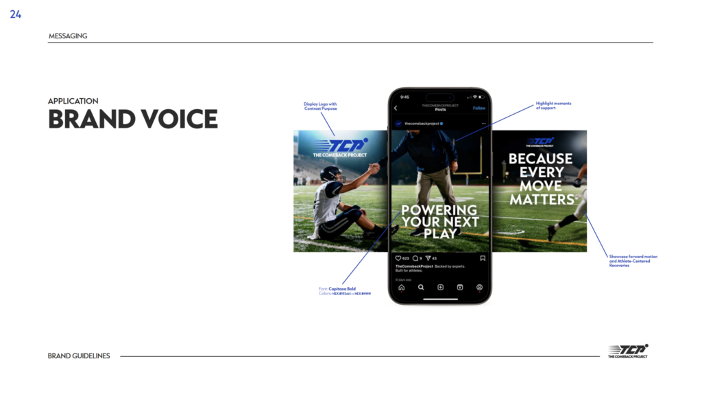
The Refinery created social guidance to help The Comeback Project show recovery, care, connection, progress, MRI access, and athlete stories across digital platforms.
Website design and build
The Refinery designed and built The Comeback Project website, extending the visual identity into a digital home for the brand’s mission, story, programs, partnerships, fundraising, and future content.
Merchandise applications
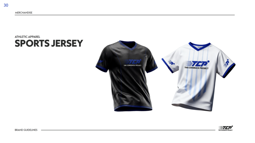
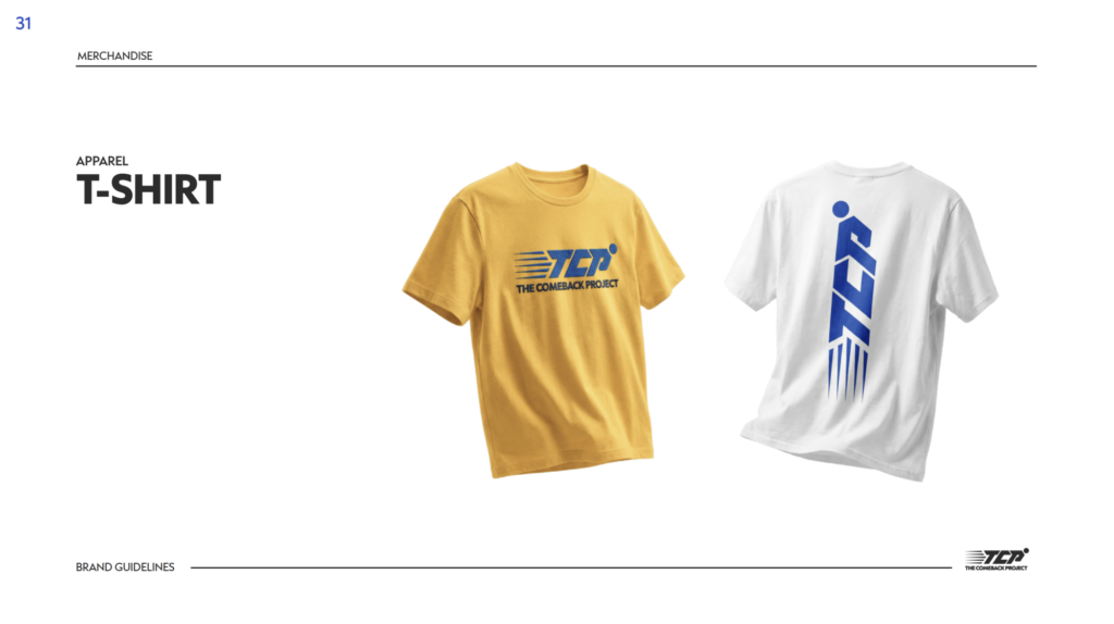
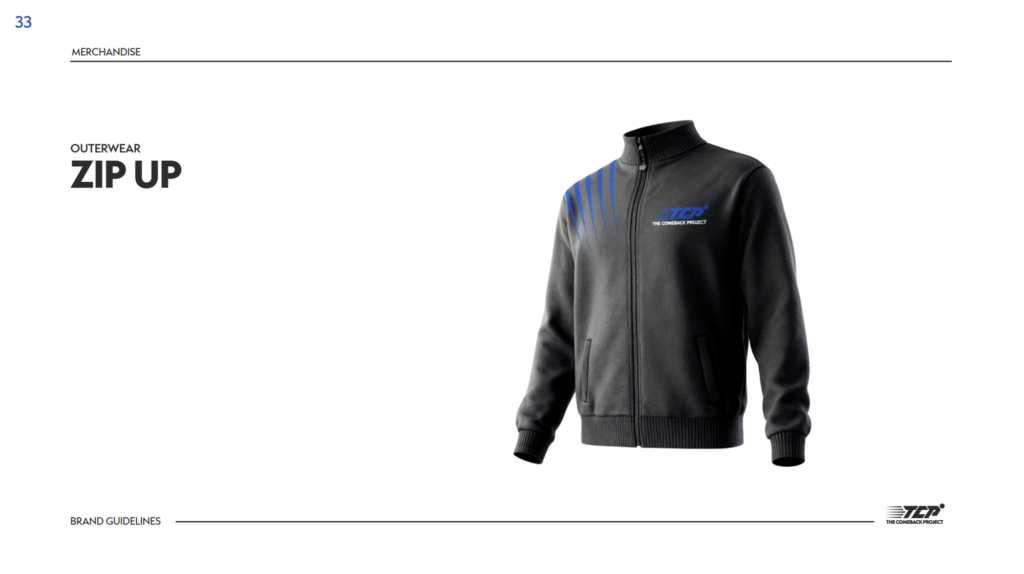
The brand system extended into merchandise applications, including athletic shirts, t-shirts, hoodies, and outerwear.
Production-ready delivery
The Refinery delivered production-ready logo assets, website assets, and brand guidance so the system could be used consistently across future materials and touchpoints.
Why it worked
The Comeback Project identity worked because it turned the brand’s purpose into a usable system.
The wordmark gave the brand recognition. The logo variations gave it flexibility. The color palette gave it focus. The typography system gave it structure. The messaging gave it heart without slipping into hype. The website gave the brand a place to live, explain itself, and grow.
That balance mattered. A student-athlete recovery initiative cannot only celebrate the finish line. The brand had to make the urgent practical promise clear — MRI scans within 72 hours, free of charge — while still feeling emotional, hopeful, and human.
It also had to understand everything before the return: the injury, the worry, the scan, the diagnosis, the care plan, the rehab, the progress, the team, and the first real step back.
The brand style guide and website that The Refinery developed gave The Comeback Project a system that could feel athletic, credible, supportive, and human across social, events, partnerships, fundraising materials, merchandise, digital content, and future campaign work.
Project details
Client: The Comeback Project
Assignment: Create a brand style guide, visual identity system, and website for a student-athlete recovery initiative
Project scope: Brand guidelines, logo design, wordmark, iconmarks, color variations, logo usage rules, typography system, brand color palette, messaging direction, social media guidance, merchandise applications, website design, website build, production-ready logo assets, and final delivery
Primary capability: Brand identity, style guide, and website design
Market: Student-athlete recovery / sports healthcare / nonprofit initiative