
The Refinery developed brand identity and packaging concepts for Frey Farms’ Sarah’s Homegrown, helping evolve a multi-generational family farm brand with a more modern visual system rooted in authenticity, quality, and agricultural heritage.
The challenge
Frey Farms needed to evolve the visual identity for Sarah’s Homegrown in a way that felt more modern without losing the story that made the brand meaningful.
As a multi-generational family farm, the brand already had a clear foundation: authenticity, quality, family values, and a direct connection to the land. The challenge was translating that heritage into a visual identity and packaging system that could connect with modern consumers, stand out in a competitive produce and CPG environment, and still feel honest to the farm’s roots.
The work needed to avoid two traps: looking too old-fashioned to feel relevant, or becoming so polished that it lost the warmth of a real family-grown brand.
The idea
The Refinery approached the Sarah’s Homegrown brand evolution as a balance between tradition and modernity.
The visual system needed to feel approachable, natural, and rooted in agricultural credibility, while also giving the brand a cleaner and more contemporary presence across packaging, advertising, and promotional materials.
The design exploration focused on a few core ideas: family legacy, quality produce, sustainable farming values, and everyday freshness. From there, The Refinery developed brand and packaging concepts that used natural color palettes, readable typography, clean layouts, and warm visual cues to create a brand expression that felt both current and connected to the farm.
What The Refinery made
Brand exploration
The Refinery explored the Sarah’s Homegrown brand through the lens of Frey Farms’ history, values, and future growth, identifying key attributes including authenticity, quality, family values, and agricultural heritage.
Visual identity concepts
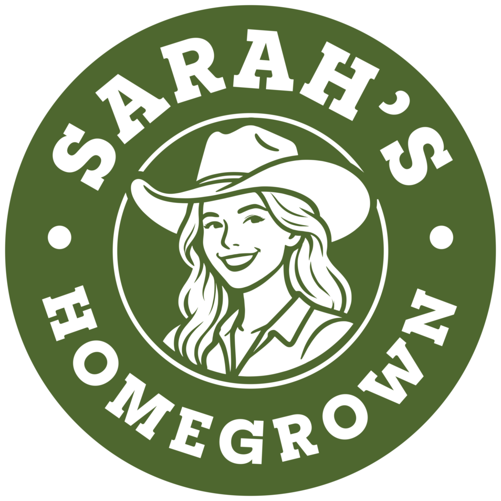
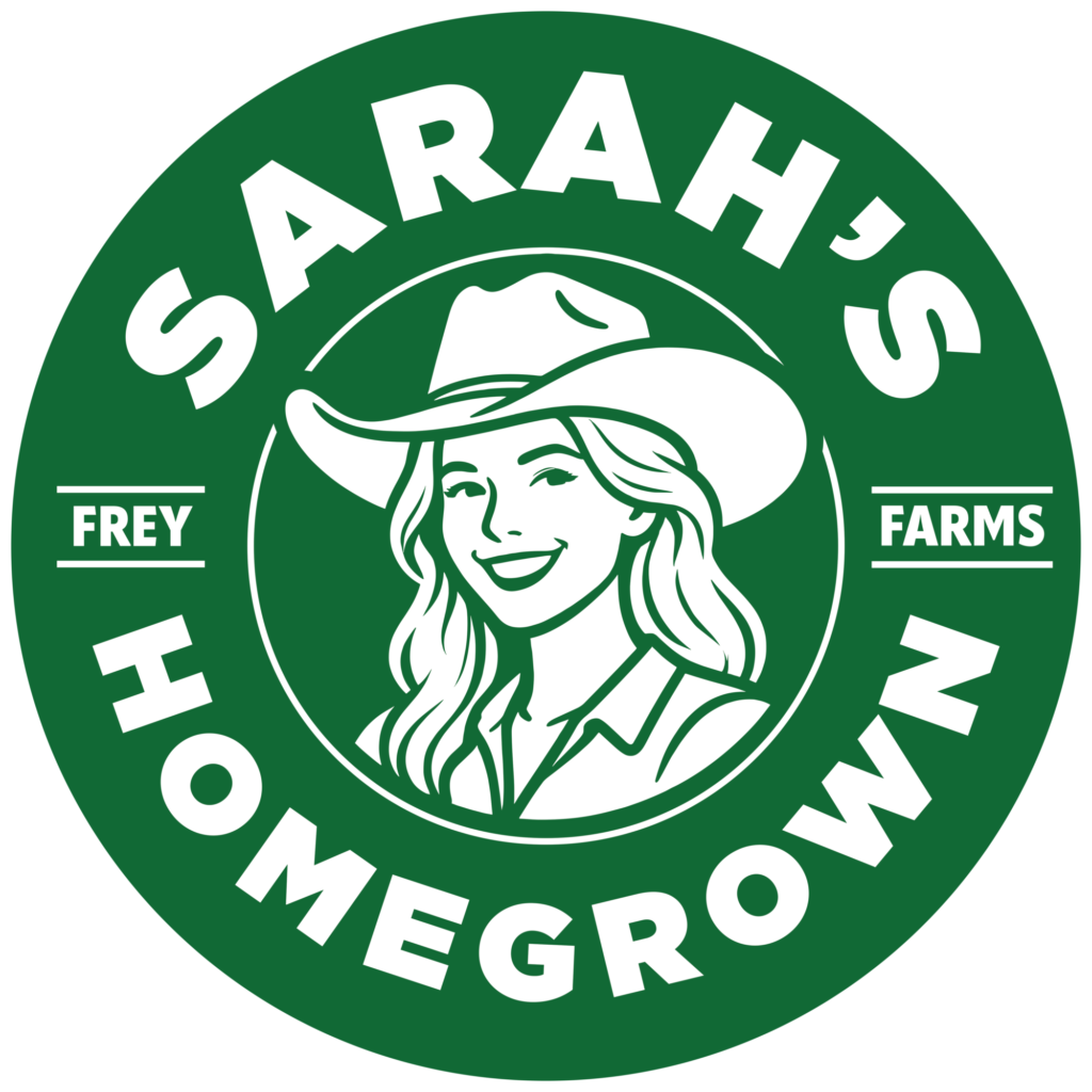
The Refinery developed visual identity concepts for Sarah’s Homegrown, creating a more contemporary brand language while preserving the warmth and credibility of a family farm.
Logo system development
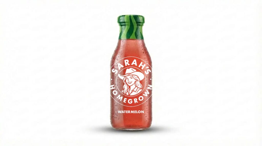
The brand work included logo exploration designed to feel approachable, timeless, and flexible across packaging, advertising, and promotional applications.
Typography and color palette
The Refinery explored typography and natural color palettes that reflected the brand’s connection to the land while improving readability, shelf presence, and consumer clarity.
Packaging concepts
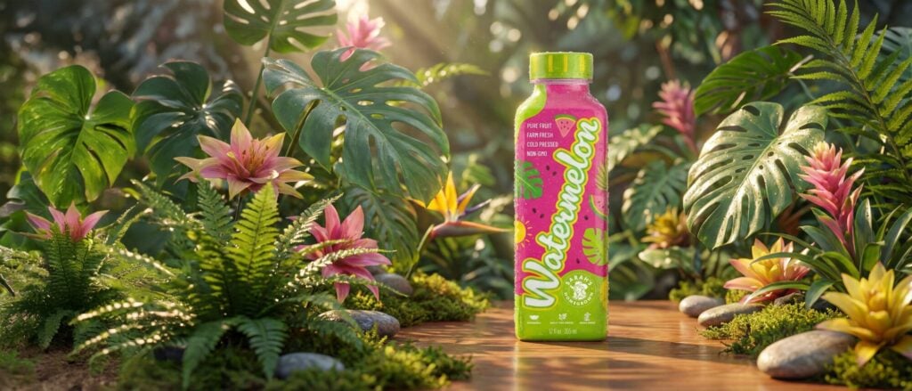
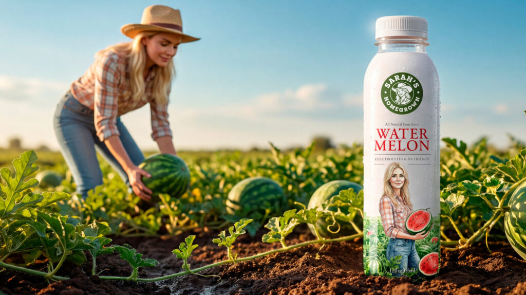
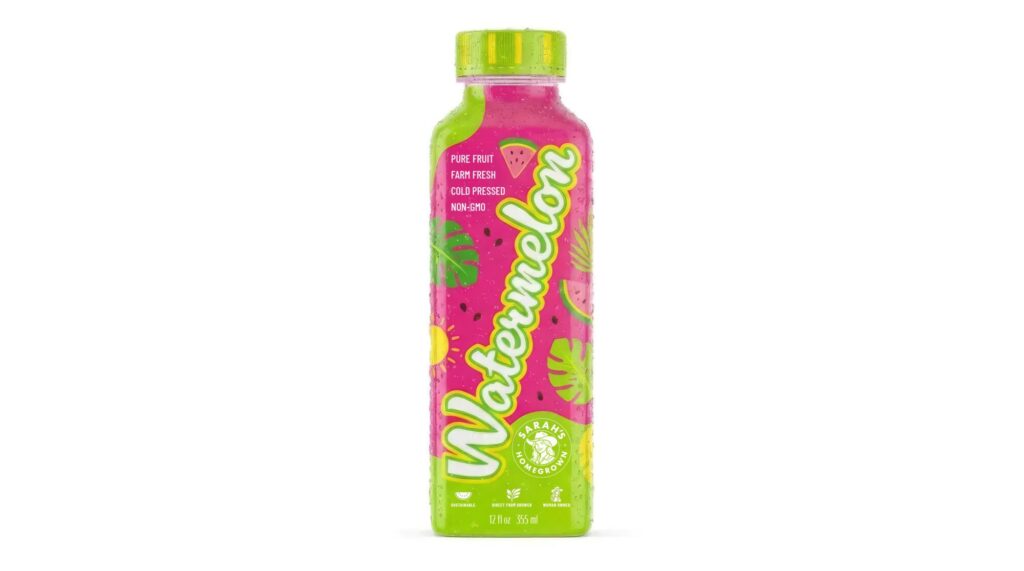
The Refinery created packaging concepts for Sarah’s Homegrown, including green bottle and white bottle design directions, product detail exploration, texture studies, and a wider packaging system view.
Advertising and promotional concepts
The brand system was extended into advertising and promotional concepts, showing how the Sarah’s Homegrown identity could live beyond the package.
Product detail and texture exploration
The packaging exploration included product details, peel effects, and texture considerations to make the brand feel more tactile, fresh, and closely tied to the product experience.

Why it worked
The Sarah’s Homegrown brand evolution worked because it treated heritage as an asset, not an aesthetic costume.
For a family farm brand, authenticity matters. But authenticity alone does not guarantee shelf impact, clarity, or modern consumer appeal. The Refinery’s concept work helped translate Frey Farms’ legacy into a cleaner and more flexible visual system that could feel natural, trustworthy, and current.
The packaging concepts gave the brand a stronger consumer-facing presence, using clear hierarchy, approachable typography, and natural color cues to communicate freshness and quality quickly. The advertising and promotional concepts showed how the identity could extend across touchpoints while staying consistent.
The result was a brand direction that honored the story behind Sarah’s Homegrown while giving it room to grow across packaging, retail, digital, and campaign applications.
A family farm, updated without losing the dirt under its nails.
Project details
Client: Frey Farms
Brand: Sarah’s Homegrown
Assignment: Evolve the brand identity and packaging concepts for a family farm produce brand
Project scope: Brand exploration, visual identity concepts, logo system development, packaging concepts, typography, color palette, advertising concepts, promotional applications, product detail exploration, and brand system development
Market: Consumer packaged goods / produce / agricultural brand
Primary capability: Brand identity and packaging design