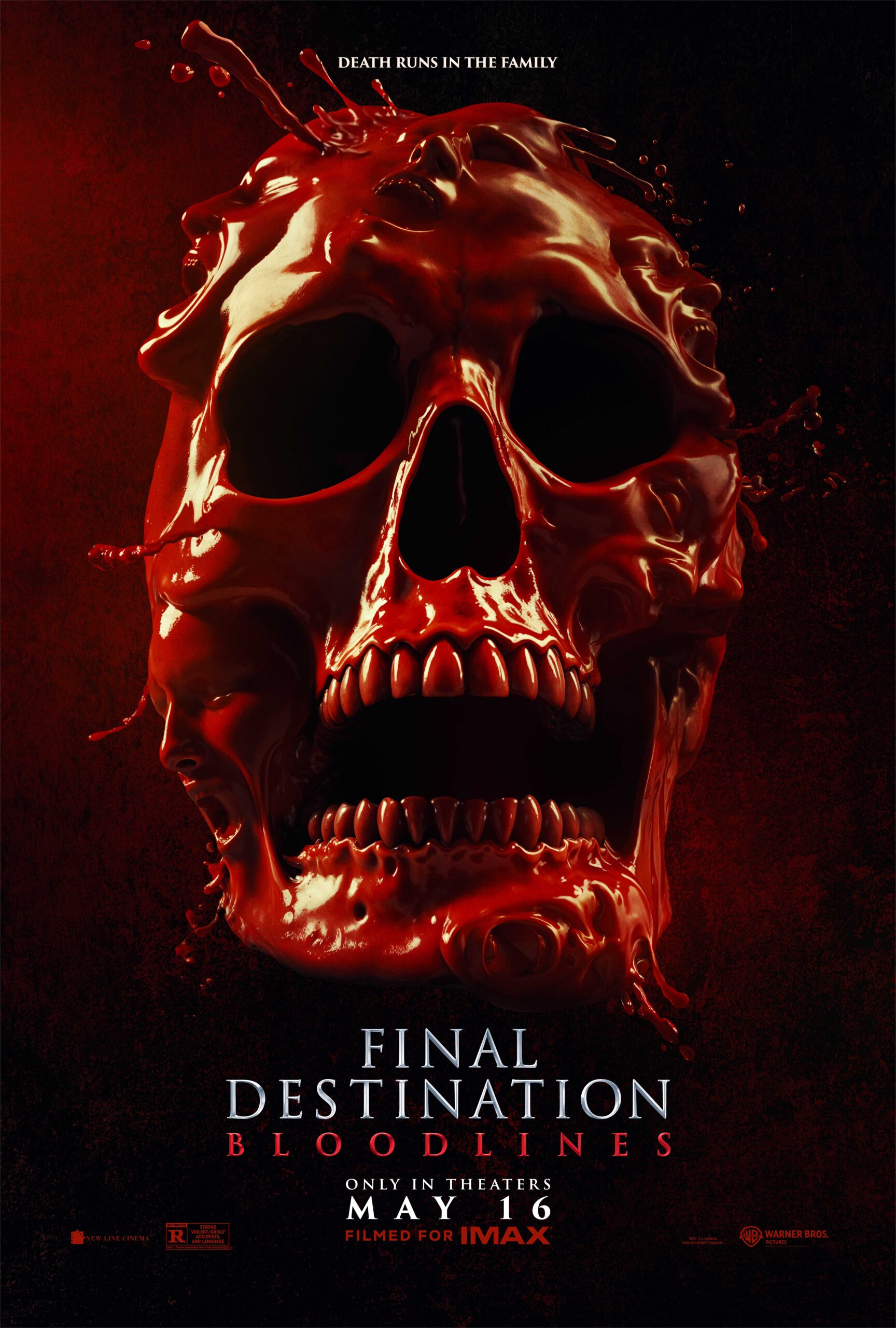
The Refinery created key art, China international theatrical art, specialty OOH, transit wraps, bus shelters, large-format billboards, and 4DX art for Warner Bros. Pictures’ Final Destination: Bloodlines, turning the franchise’s darkly funny sense of inevitable disaster into a campaign system built for the street, the screen, and the nostalgia of knowing exactly why a log truck still feels like a threat.
The challenge
Final Destination has one of horror’s most specific promises: ordinary life is full of things that can go extremely, elaborately wrong.
For Final Destination: Bloodlines, the campaign needed to honor that franchise DNA while making the new theatrical release feel fresh, physical, and impossible to ignore. The work had to carry the familiar dread, dark humor, and cause-and-effect paranoia of the series across key art, international art, transit, bus shelters, billboards, specialty OOH, and premium theatrical formats.
The campaign could not simply say danger was coming.
It had to make the world feel like it had already started misbehaving.
The idea
The Refinery approached the Final Destination: Bloodlines campaign by turning everyday public spaces into little moments of franchise logic.
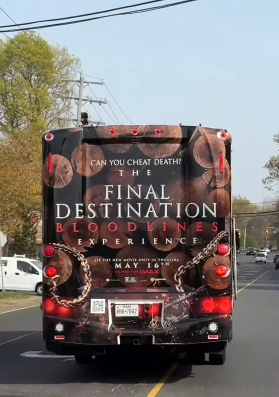
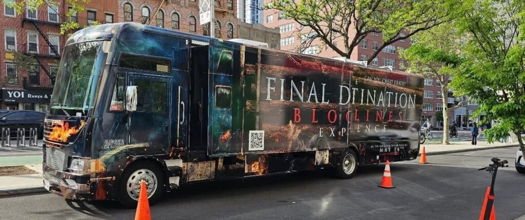
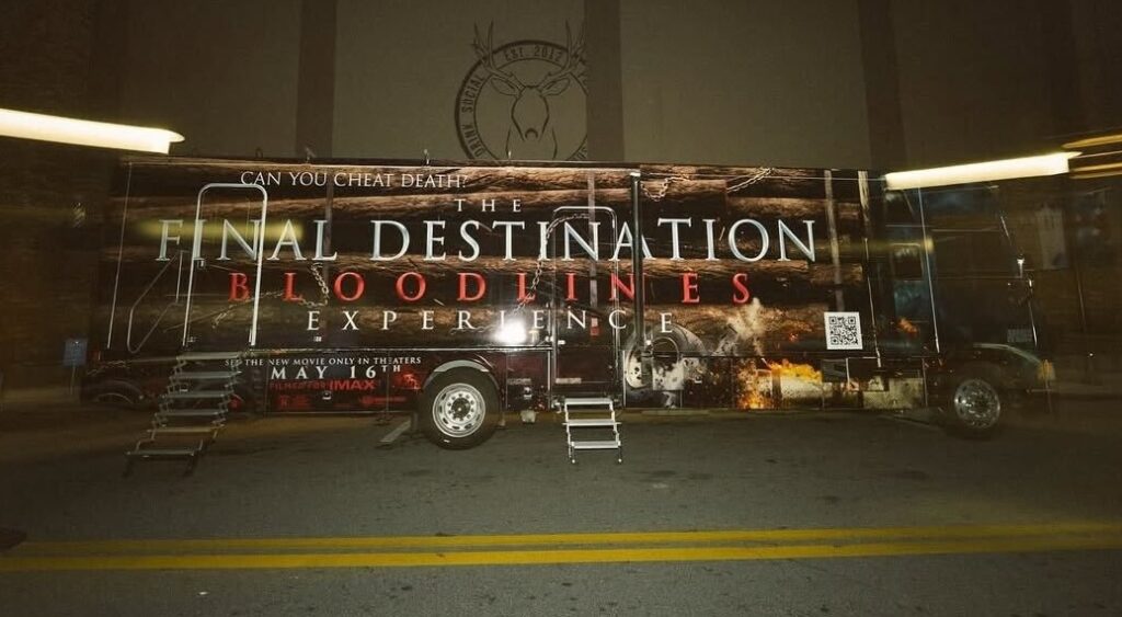
A billboard installation became a scene. A transit wrap became the infamous log truck. A bus shelter became broken glass. Local LA insurance ads became part of the joke. Large-format outdoor became a way to make the title feel physically present, not just promoted.
The campaign’s OOH did not just advertise the film. It behaved like the film.
For fans, part of the pleasure of Final Destination is knowing that nothing in the frame is innocent. So the campaign gave audiences creative worth looking at twice.
What The Refinery made
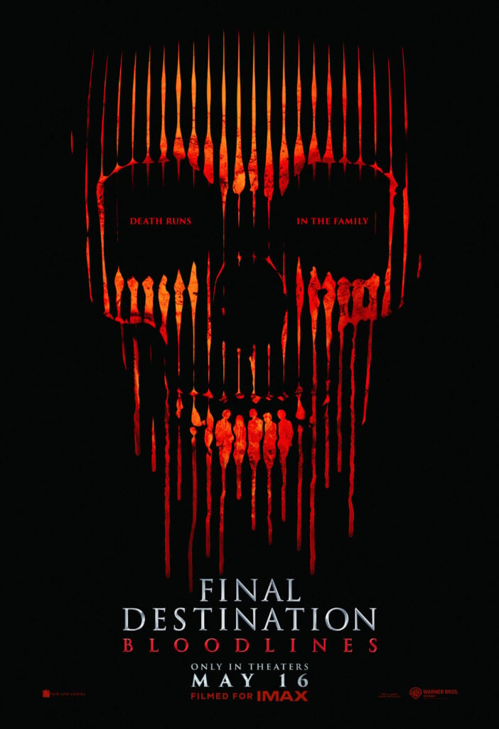
Key art and campaign creative
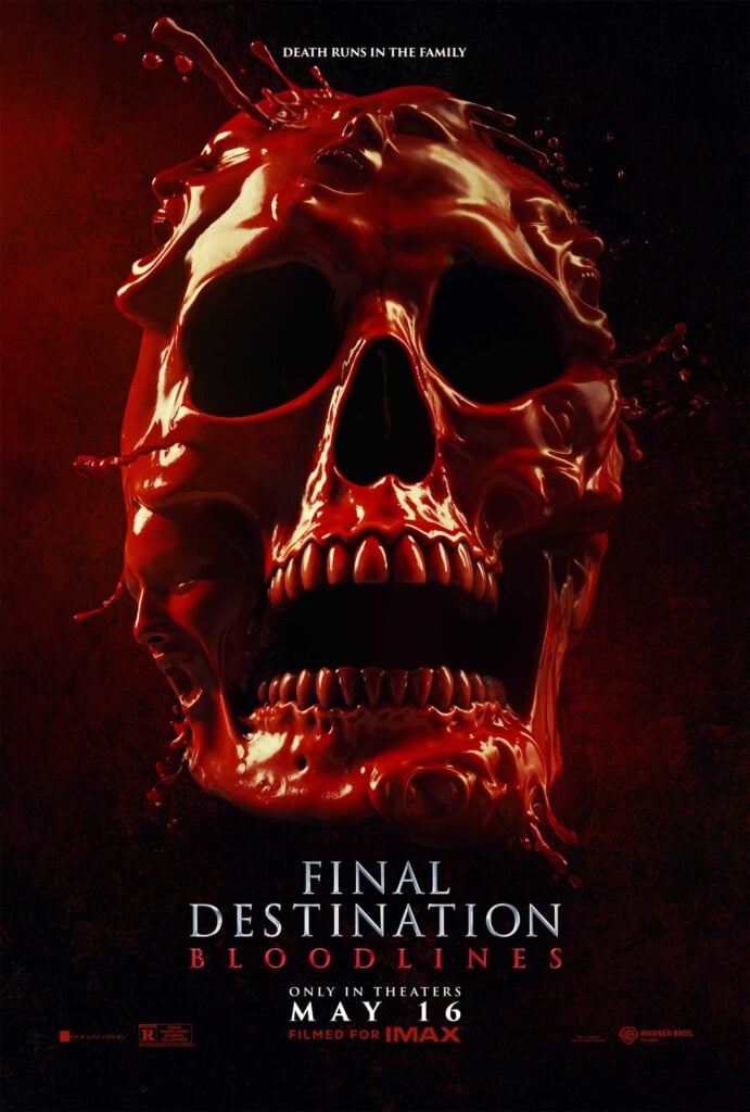
The Refinery created key art for Final Destination: Bloodlines, establishing the visual foundation for the campaign across theatrical, outdoor, and specialty placements.
China and UK international theatrical campaign art
The Refinery developed United Kingdom and China international theatrical art for Final Destination: Bloodlines, adapting the campaign’s visual system for key global markets while maintaining the franchise’s horror tone and theatrical impact.
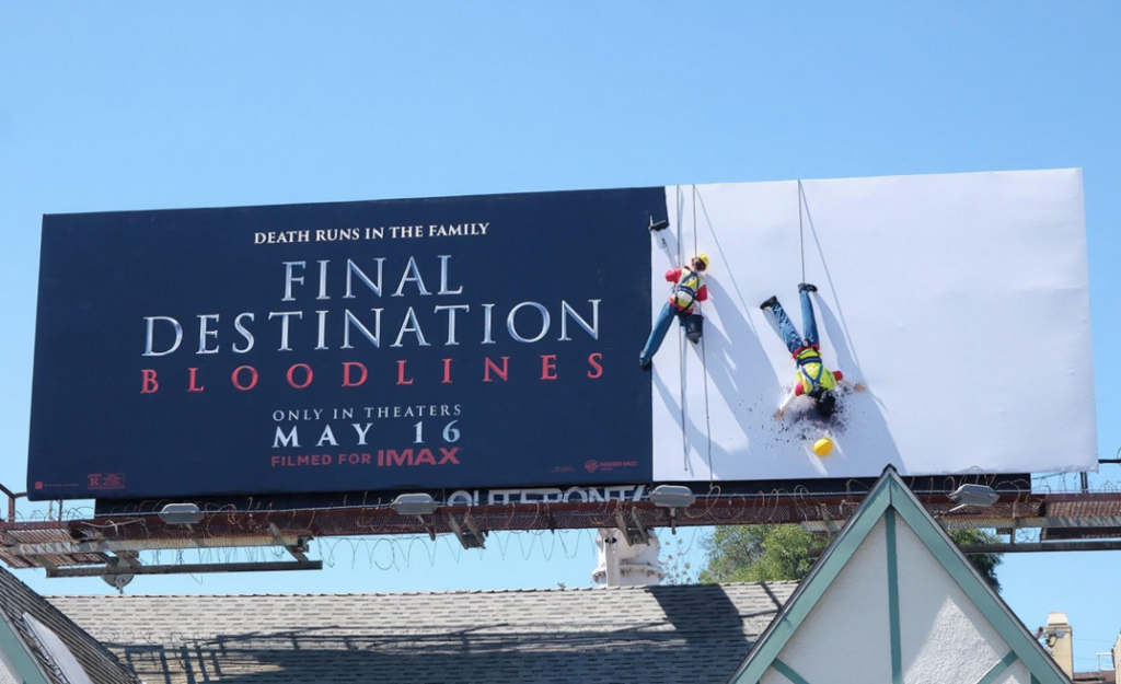
Specialty OOH: “The Fall” billboard
The Refinery created “The Fall,” a specialty billboard execution staged to look as though a construction worker had died while installing the board. The placement became part of the premise: a franchise-style accident scene hiding in plain sight.
Log truck transit wrap
The Refinery created a transit wrap designed to resemble the franchise’s infamous log truck, bringing one of the series’ most memorable visual references into everyday traffic.
Local LA bus shelters
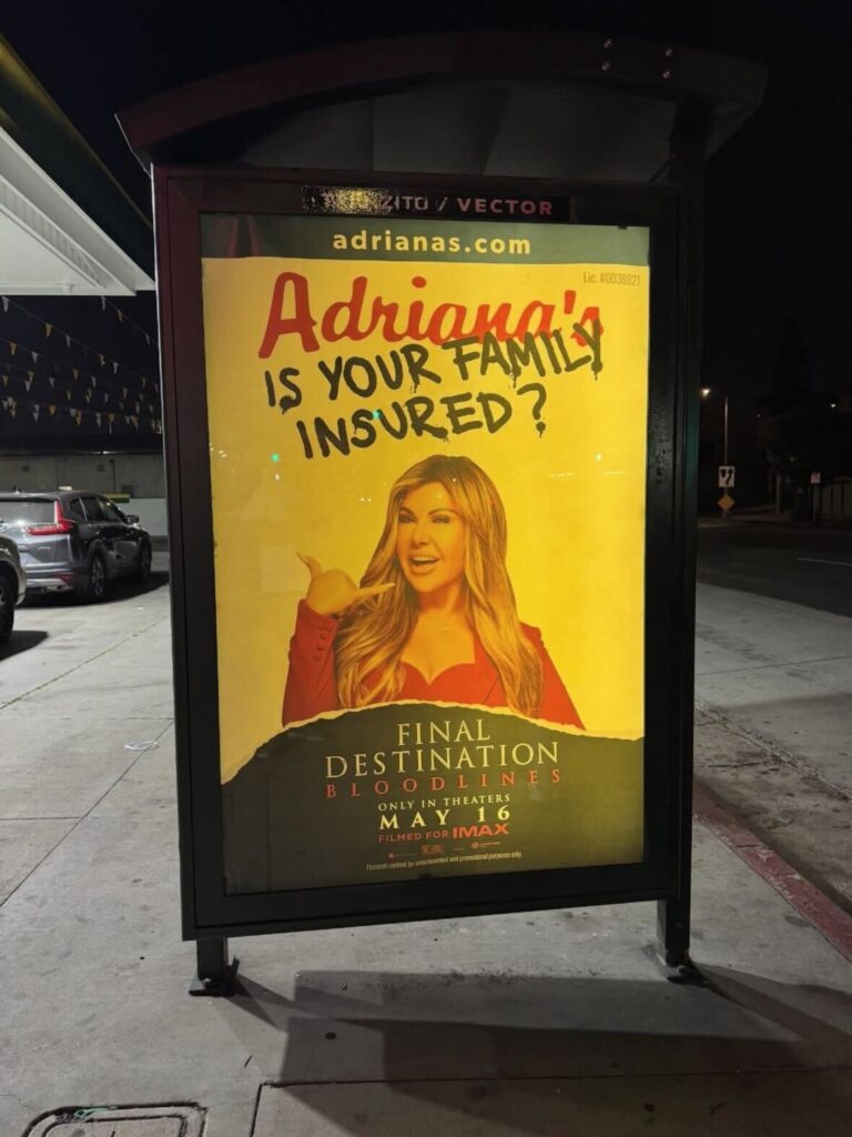
The campaign included bus shelter executions featuring Adriana’s Insurance, a very Los Angeles detail that gave the work market-specific dark humor.
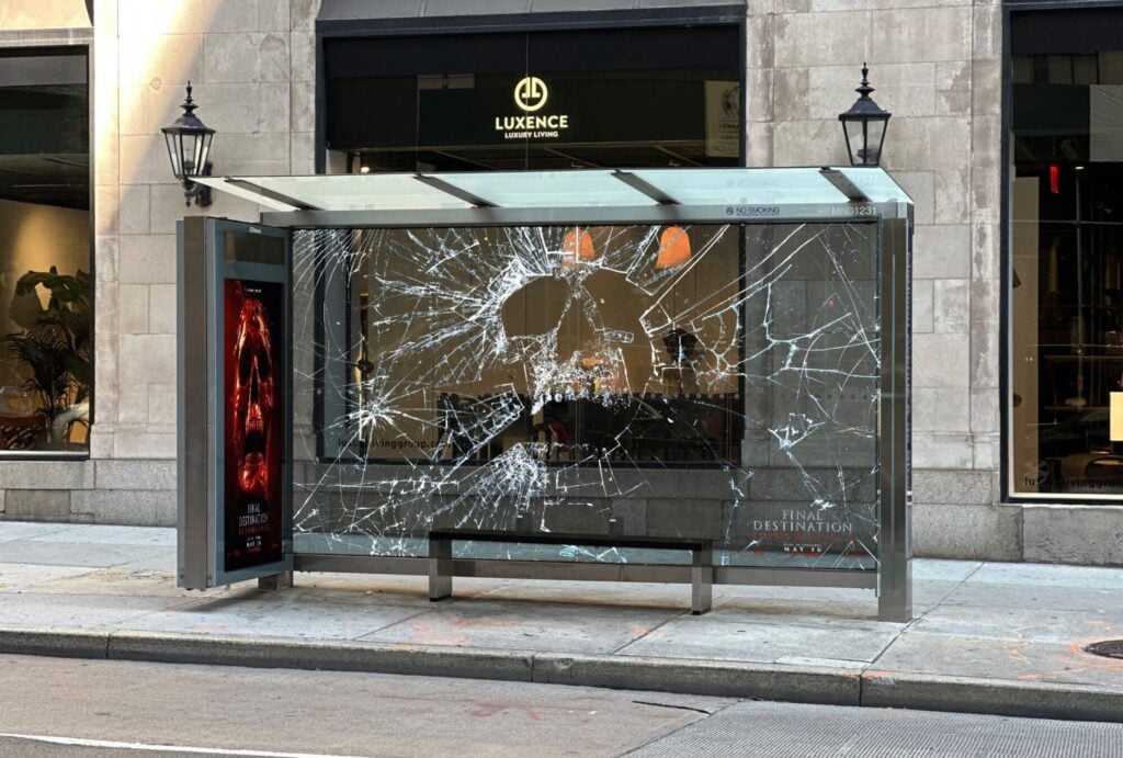
Broken-glass skull bus shelter
The Refinery created a street-level shelter with a broken-glass skull effect, turning a local placement into a quick-read horror image built for walk-up viewing and social capture.
Large-format OOH and billboards
The campaign included numerous additional billboards and outdoor placements designed to extend the key art and campaign world across public space.
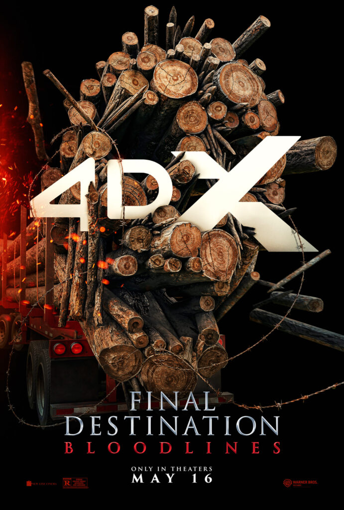
4DX art
The Refinery created 4DX art for Final Destination: Bloodlines, connecting the campaign’s sense of physical danger to a premium theatrical format built around motion, atmosphere, and sensory impact.
Production, finishing, and delivery
Across formats, The Refinery handled production artwork, versioning, finishing, and final delivery so the campaign could hold together across key art, international art, specialty OOH, transit, bus shelters, billboards, and premium theatrical materials.

Why it worked
The Final Destination: Bloodlines campaign worked because the outdoor did not feel like standard horror advertising applied to public space. It made public space feel suspicious.
A transit wrap did not just carry the title. It became the log truck. A bus shelter did not just display the campaign. It looked broken. A billboard did not just announce the film. It looked like something terrible had happened during installation. The work used familiar city objects and made them feel suddenly unsafe, darkly funny, and completely title-right.
It also worked across multiple levels of recognition. A casual passerby could understand the joke quickly. A franchise fan could catch the reference. A local LA audience could appreciate the Adriana’s Insurance placement. A social viewer could understand the idea from a photo or clip. Each execution was built to be legible in real life and replayable online.
The campaign gave Final Destination: Bloodlines a physical street presence that matched the franchise’s tone: darkly funny, instantly legible, and built to be noticed in person and shared online.
For a franchise about disastrous chain reactions, the city became part of the setup.
Project Details
Client: Warner Bros. Pictures
Title: Final Destination: Bloodlines
Assignment: Create key art and specialty campaign assets for a theatrical horror franchise release
Project scope: Key art, China and UK international theatrical art, specialty OOH, transit wraps, local LA bus shelters, broken-glass shelter creative, large-format billboards, 4DX art, production artwork, finishing, and final delivery
Markets: Domestic and international, including Los Angeles, China, and the UK