The Refinery created a Brand Atlas and visual identity application concepts for ADT, organizing the brand system across logo usage, typography, color, photography direction, vehicle wraps, security signage, employee credentials, and product packaging.
The challenge
ADT already had one of the most recognizable marks in home security. The challenge was not to reinvent the brand. It was to help organize, clarify, and extend it.
A national security brand has to show up across a lot of everyday surfaces: service vehicles, lawn signs, packaging, employee credentials, sales materials, photography, video, digital touchpoints, and customer-facing environments. Each piece needed to feel connected to the same system.
For a brand built on trust, consistency was not just a design preference. It was part of the customer experience.
The idea
The Refinery approached the ADT Brand Atlas as a practical brand system: clear visual rules paired with real-world applications.
The ADT octagon, blue palette, geometric typography, and clean layout structure became the anchors. From there, the system could flex across home security and business security applications while preserving recognition.
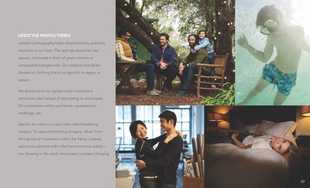
The visual direction balanced authority and approachability. Security branding needs to feel credible, but not cold. Protective, but not alarmist. The photography direction helped make the brand feel connected to real life, using authentic homes, relatable people, everyday moments, and subtle motion instead of overly staged or composited scenes.
The goal was to make ADT feel consistent wherever it appeared.
On a van. On a lawn. On a package. Around someone’s neck at an event.
Brand systems: glamorous in the least glamorous places, which is usually where they matter most.
What The Refinery made
Brand Style Guide
The Refinery created an ADT Brand Atlas to organize the company’s visual identity system across logo usage, typography, color, photography, video, and brand applications.
Logo usage guidance
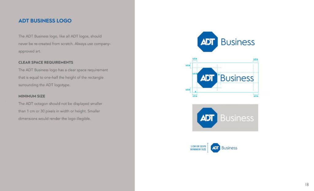
The guide included ADT logo usage rules, including clear space, minimum size, approved art guidance, and layout examples for ADT Business applications.
Typography system
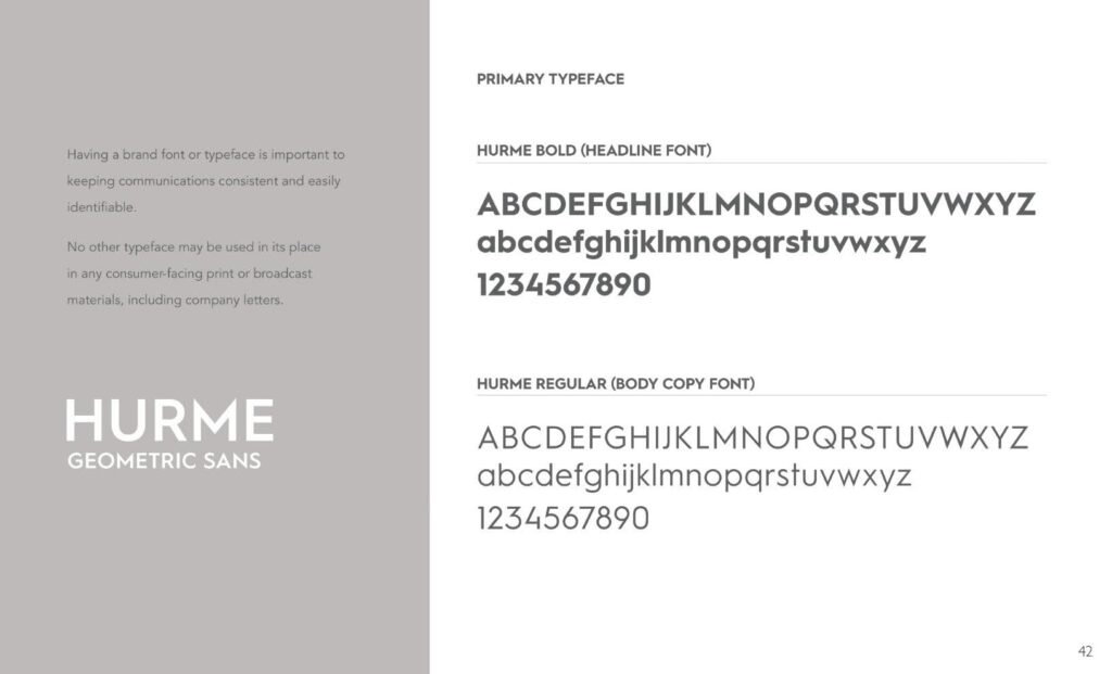
The Brand Atlas established Hurme Geometric Sans as the primary typeface system, with headline and body copy guidance for consistent communication across consumer-facing materials.
Color system
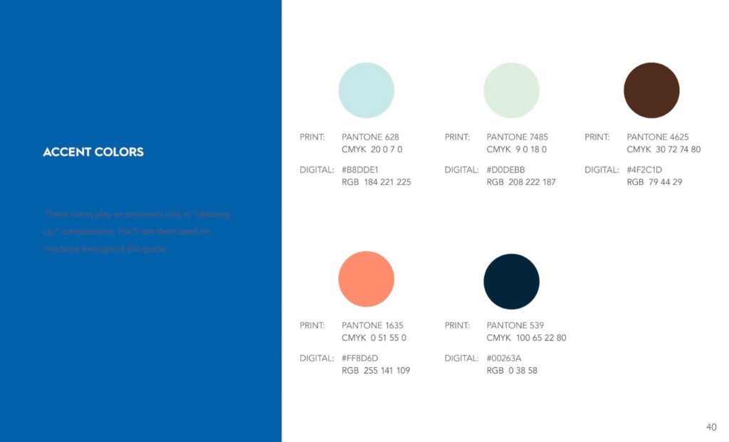
The Refinery developed color guidance for ADT, including core brand blue and supporting accent colors for layouts, applications, and visual compositions.
Photography and video direction
The guide included lifestyle photo and video direction focused on authentic moments, real spaces, relatable people, and “breathing imagery” with subtle motion.
People photography guidance
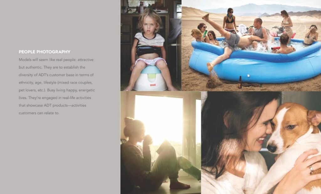
The photography direction emphasized real-feeling people, diversity of age, ethnicity, lifestyle, couples, families, pet owners, and everyday activities customers could recognize.
Van wrap concepts
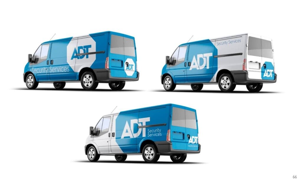
The Refinery created ADT Security Services van wrap concepts showing how the brand system could extend across service vehicles with strong visibility, clean logo placement, and recognizable blue-and-white geometry.
Lawn security sign concept
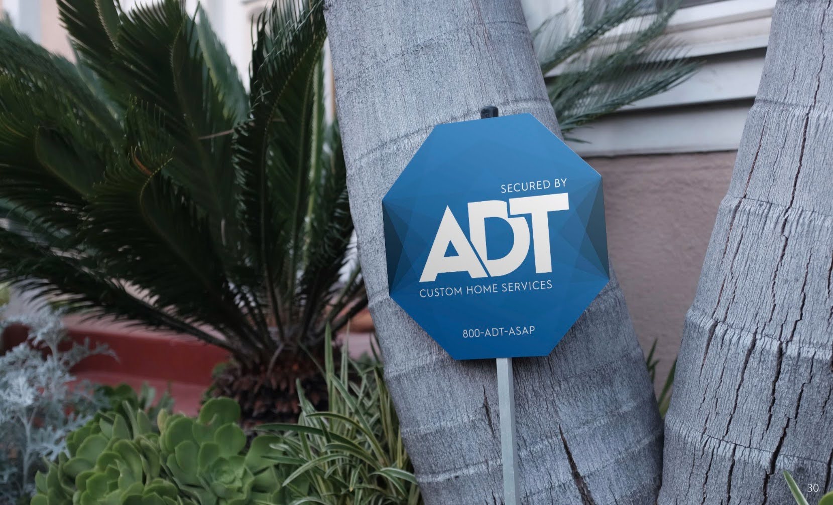
The Refinery created an ADT lawn security sign concept using the octagon, layered blue treatment, and clear service messaging for residential environments.
Employee lanyards and ID card mockups
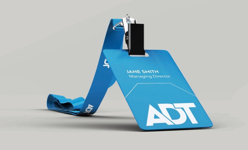
The Refinery developed employee lanyard and ID card mockups for internal, event, field, and customer-facing credential applications.
Packaging concept
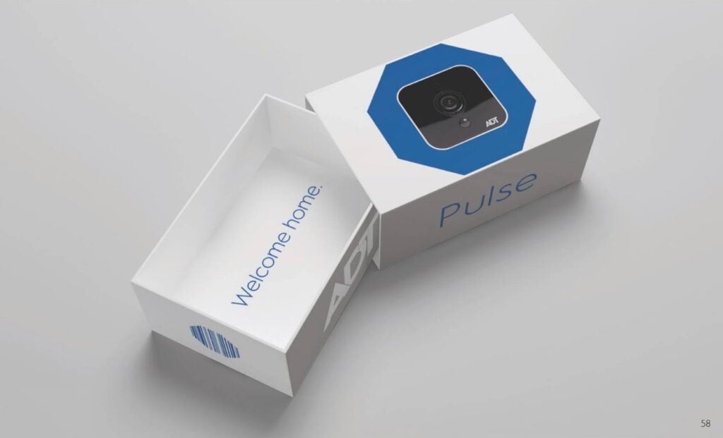
The Refinery created ADT Pulse packaging concepts, applying the brand system to a clean, modern product and customer unboxing experience.
Why it worked
The ADT Brand Atlas worked because it turned a familiar identity into a more usable system.
For a security company, the brand often appears in small but important moments: a sign outside a home, a service van on the street, an employee badge, a product box, a sales touchpoint, or a photo in a campaign. Each one has to quietly say the same thing: this is real, established, and trustworthy.
The Refinery’s work helped connect those moments. Logo rules protected recognition. Typography created consistency. The color system gave the brand range without losing ADT blue. Photography guidance made the brand feel more human. The mockups showed how the system could behave across real customer-facing surfaces.
A good brand guide cannot only look nice as a PDF. It has to survive the van wrap, the lawn sign, the badge, the box, the photo library, and the person trying to use it six months later.
The Refinery helped ADT turn familiar brand equity into a clearer visual system: structured, recognizable, and ready for the places a security brand actually lives.
Which is apparently everywhere. Especially the front yard.
Project details
Client: ADT
Assignment: Develop a brand style guide and visual identity applications for a national home and business security brand
Project scope: Brand style guide, logo usage guidance, color system, typography guidance, photography and video direction, people photography guidance, van wrap concepts, lawn security sign concepts, employee lanyards and ID card mockups, and product packaging concepts
Primary capability: Brand style guide and visual identity systems
Market: Home security / business security / consumer services