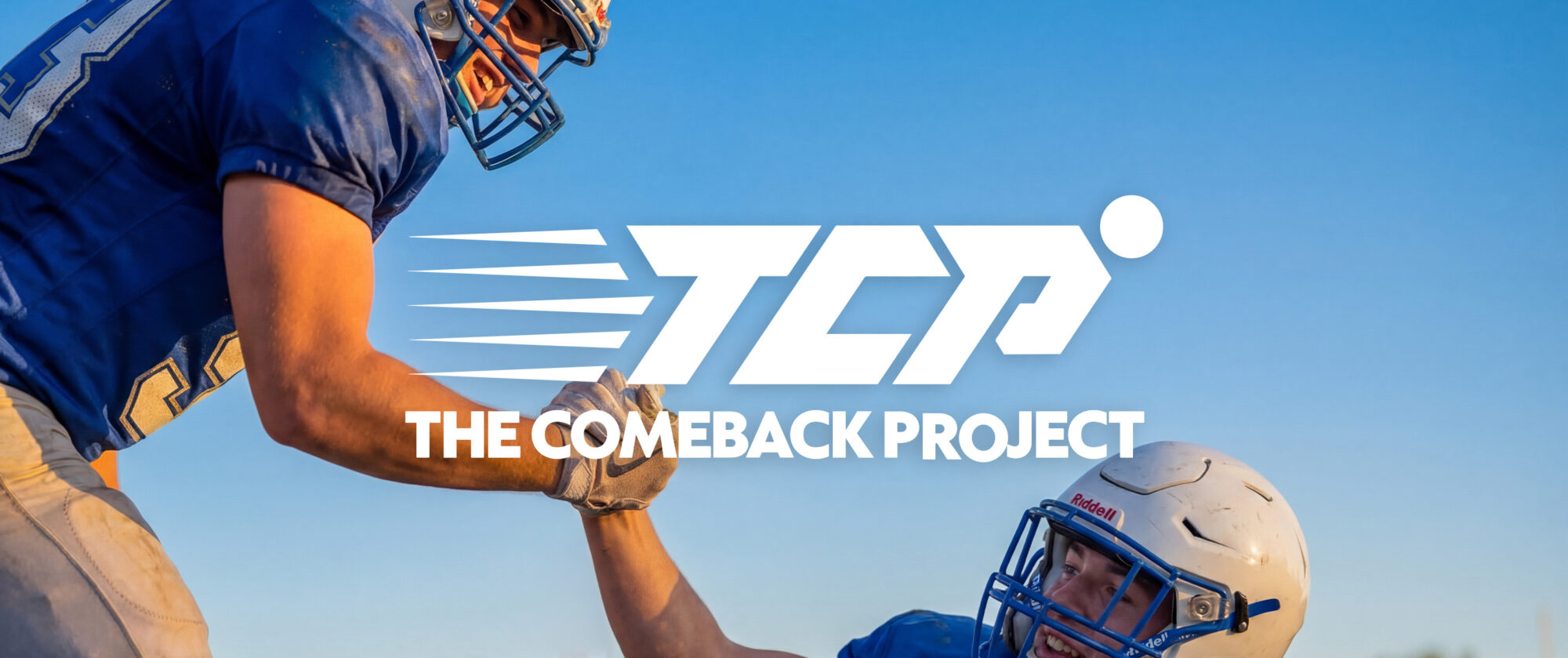
A brand built for recovery and what comes next.
The Refinery created the visual identity, brand system, and website for The Comeback Project, an initiative helping injured student-athletes access free MRI scans within 72 hours.
The brand needed to communicate urgency and credibility while still feeling hopeful, human, and rooted in the athlete’s journey back.
The Challenge
An injury creates uncertainty for student-athletes and their families. When X-rays don’t provide enough information, delays in diagnosis can also delay the path toward recovery.
The Comeback Project needed an identity that could clearly communicate its mission while balancing several qualities: athletic without feeling aggressive, credible without feeling clinical, and supportive without feeling soft.
It also needed a flexible system that could grow across digital, social, fundraising, partnerships, events, and merchandise.
The Idea
Build the brand around forward momentum.
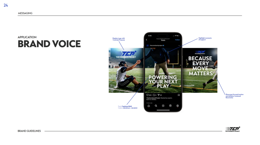
We developed The Comeback Project identity around motion, progress, and the journey back.
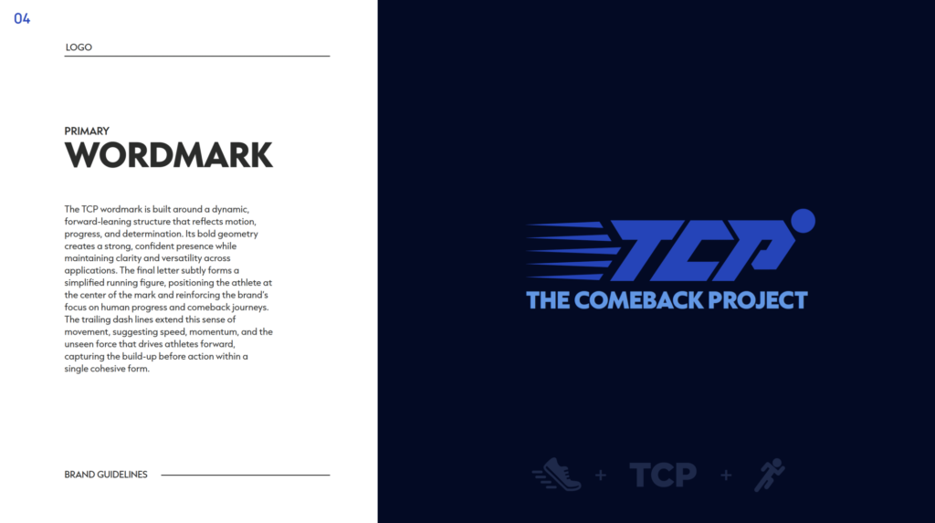
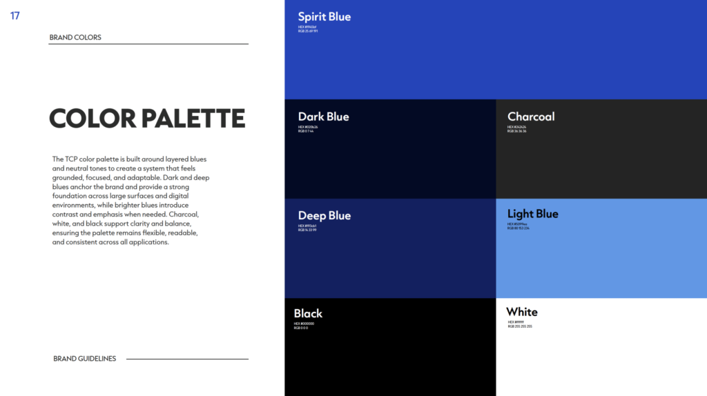
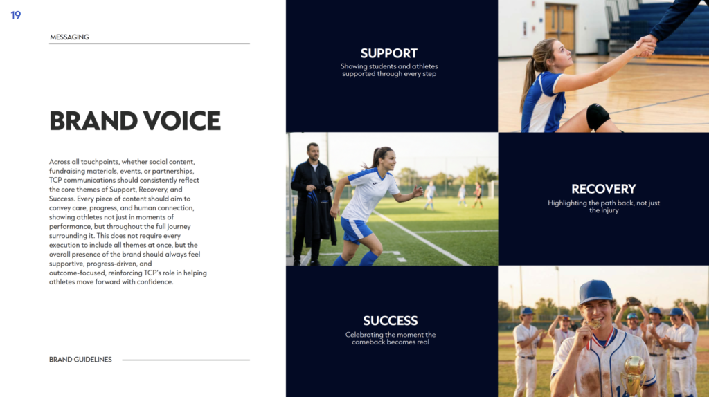
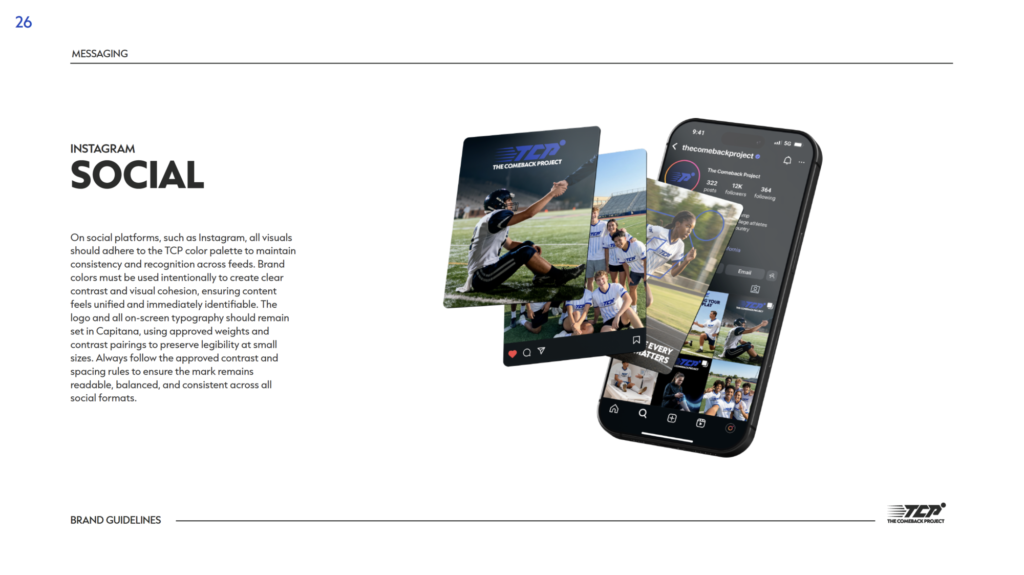
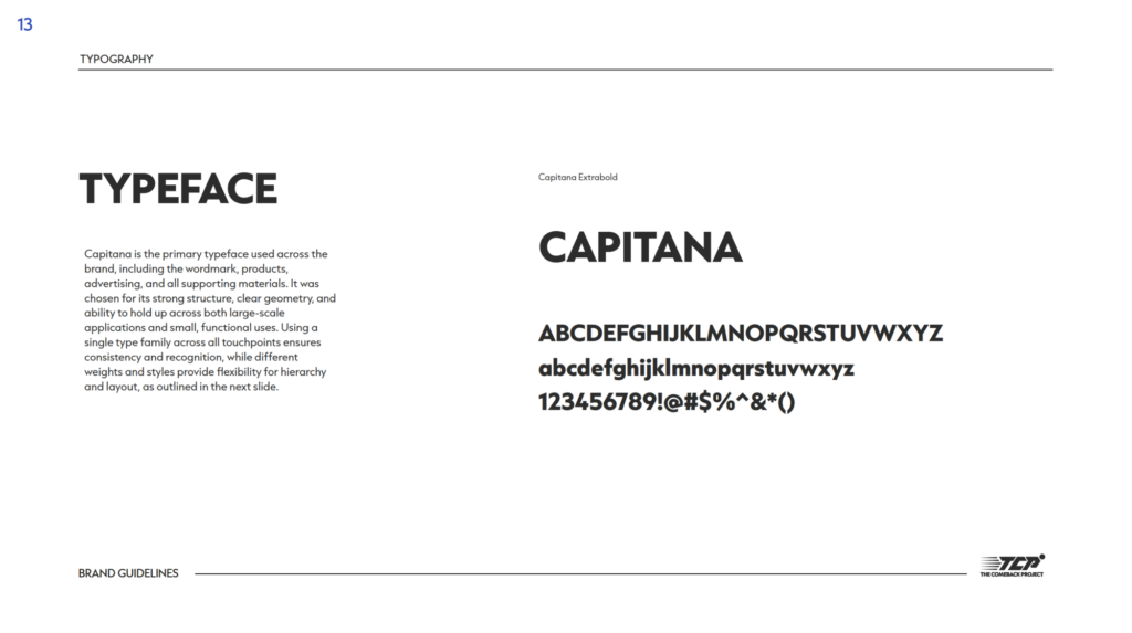
The TCP wordmark, motion-inspired graphic elements, layered blues, typography, and messaging system created an identity designed to feel athletic, focused, and human.
That same thinking extended into the website, creating a digital experience that could quickly explain the mission while giving the organization room to tell athlete stories, build partnerships, support fundraising, and grow.
The Work
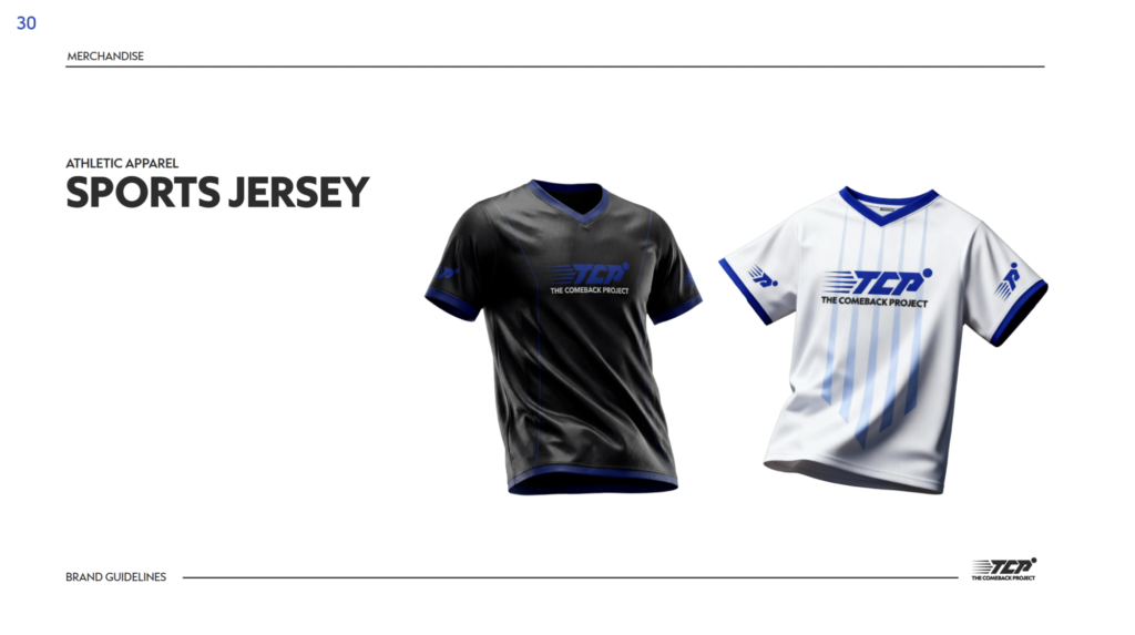
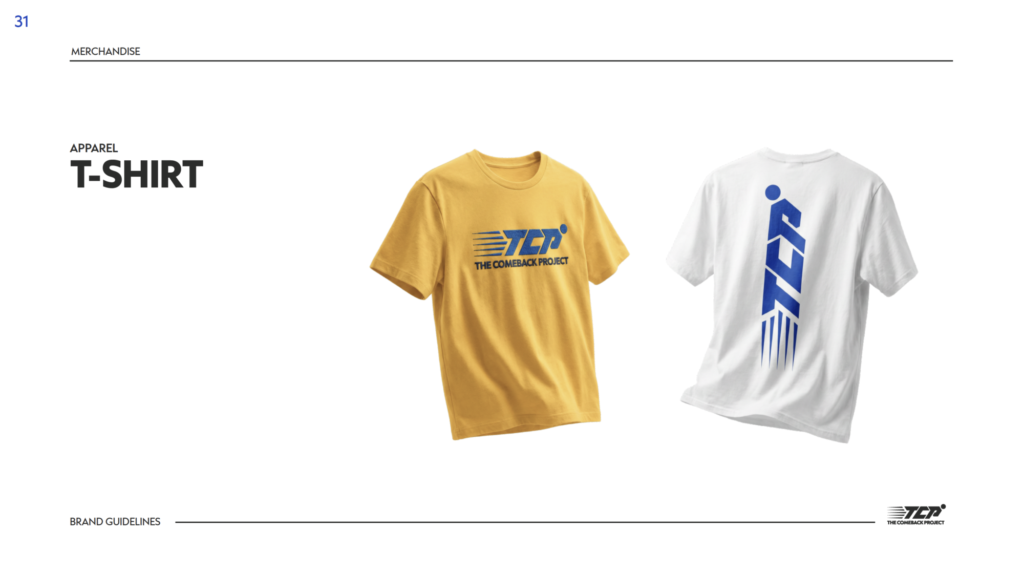
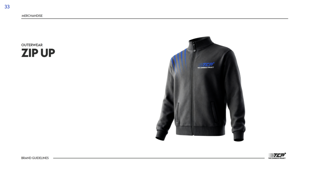
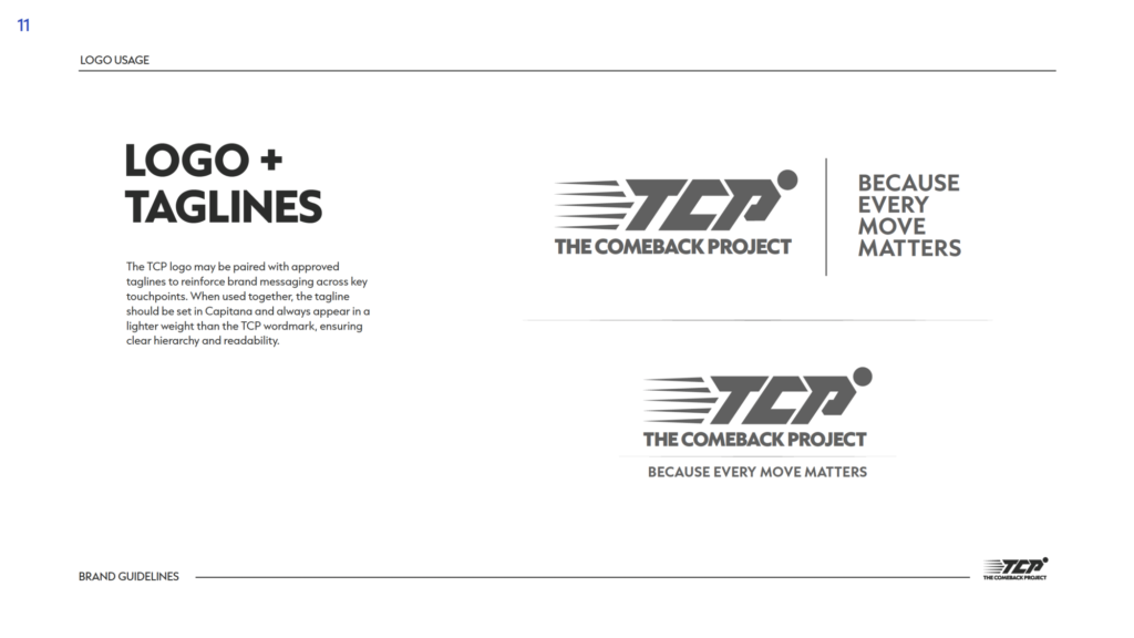
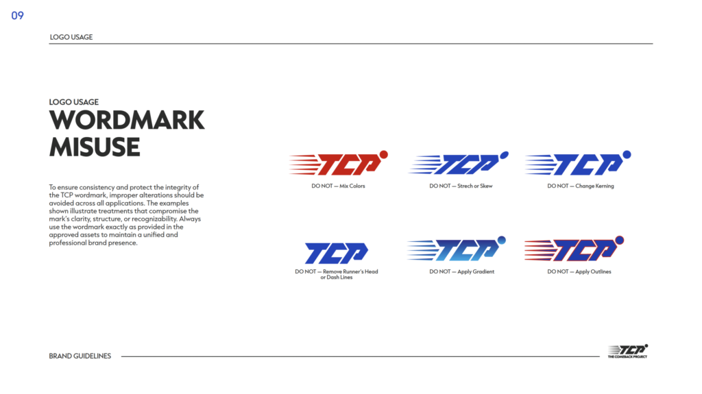
The Refinery created a complete visual identity system and brand style guide spanning logo and wordmark design, iconmarks, typography, color, messaging, social guidance, and merchandise applications.
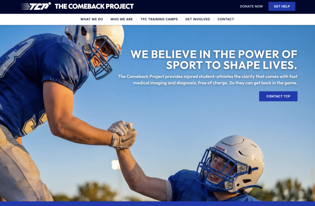
We also designed and built The Comeback Project website, translating the identity into a digital home for the organization’s mission, programs, athlete stories, partnerships, and fundraising.
Production-ready brand and digital assets gave the organization a flexible system designed to remain consistent as it grows.
The Impact
An identity designed to move forward.
The new brand gave The Comeback Project a recognizable visual and digital system built around its purpose: helping student-athletes get clearer answers and start their path back sooner.
From the wordmark to the website, every element reinforced the same idea of progress, recovery, and forward momentum.
Project details
Client: The Comeback Project
Assignment: Create a brand style guide, visual identity system, and website for a student-athlete recovery initiative
Project scope: Brand guidelines, logo design, wordmark, iconmarks, color variations, logo usage rules, typography system, brand color palette, messaging direction, social media guidance, merchandise applications, website design, website build, production-ready logo assets, and final delivery
Primary capability: Brand identity, style guide, and website design
Market: Student-athlete recovery / sports healthcare / nonprofit initiative