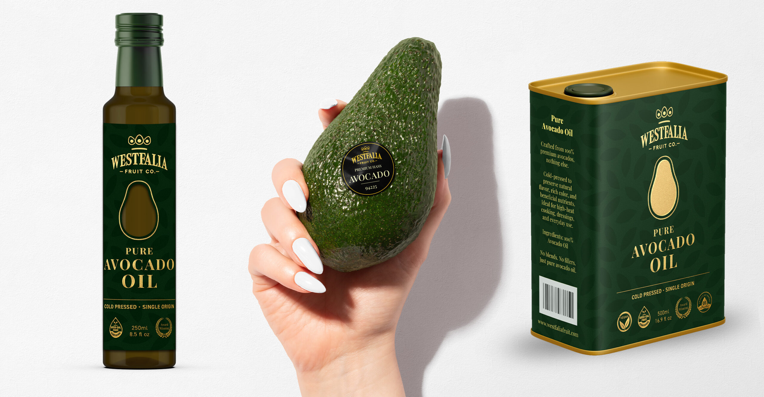
The Refinery refreshed the brand identity and packaging design system for Westfalia Pure Avocado Oil, helping elevate the product’s shelf presence with cleaner typography, refined hierarchy, a premium color palette, and a more sophisticated visual expression.
The Challenge
Westfalia Fruit Co. needed to reposition Westfalia Pure Avocado Oil as a more premium, shelf-ready product in a crowded category.
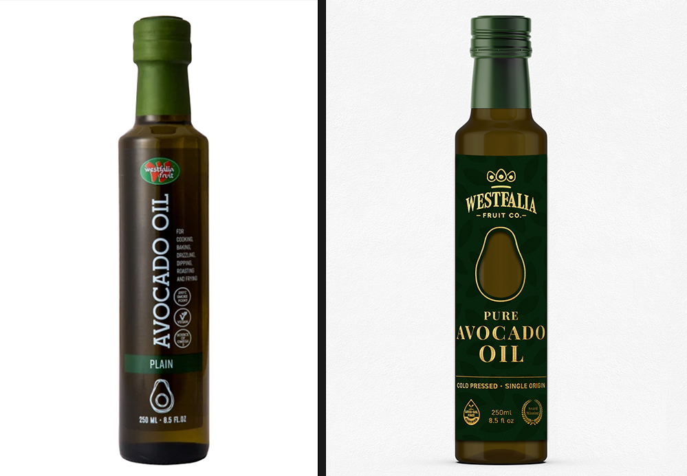
The existing packaging did not fully communicate the quality of the oil inside. It lacked the visual hierarchy, sophistication, and premium cues needed to stand out against other natural food and specialty cooking oil brands.
The challenge was to create a brand identity and packaging system that felt clean, natural, elevated, and trustworthy without becoming overly decorative or losing clarity at shelf.
Avocado oil. But make it look like it knows what it’s doing.
The Idea
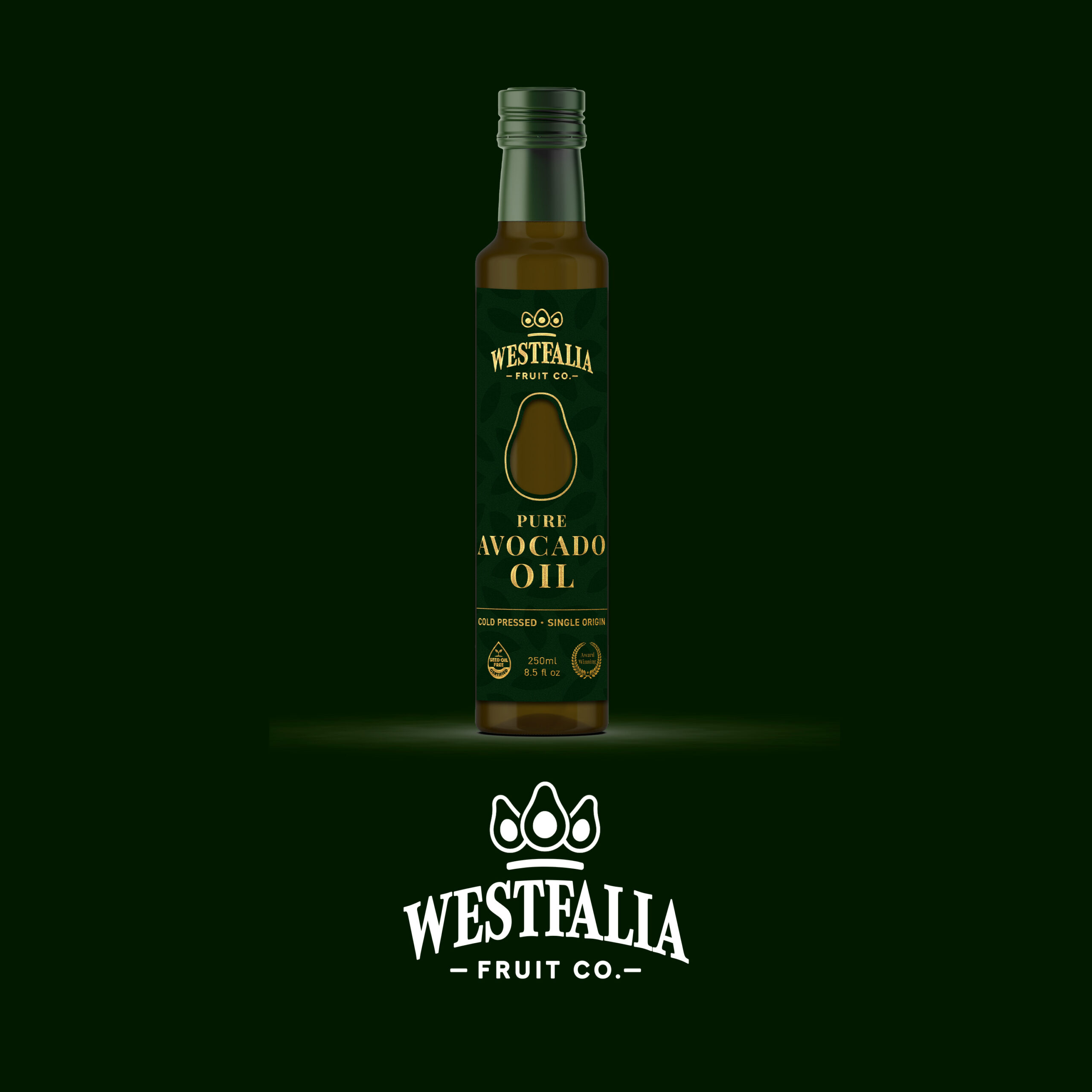
The Refinery approached the redesign around three ideas: purity, quality, and shelf presence.
The new identity needed to feel refined enough for a premium product, but still grounded in the natural origins of avocado oil. That meant building a system around clean typography, a controlled color palette, clear label hierarchy, and design choices that helped the product feel more considered in hand and more recognizable on shelf.
Rather than overloading the packaging with visual cues, The Refinery used restraint as a signal of quality. The design gave the product room to breathe, using white space, refined typography, and natural color references to create a more premium read.
The goal was not to make the bottle louder. It was to make the design feel more confident.

Before & After
Brand identity refresh — A cleaner, more premium brand expression aligned with the natural quality of the product.
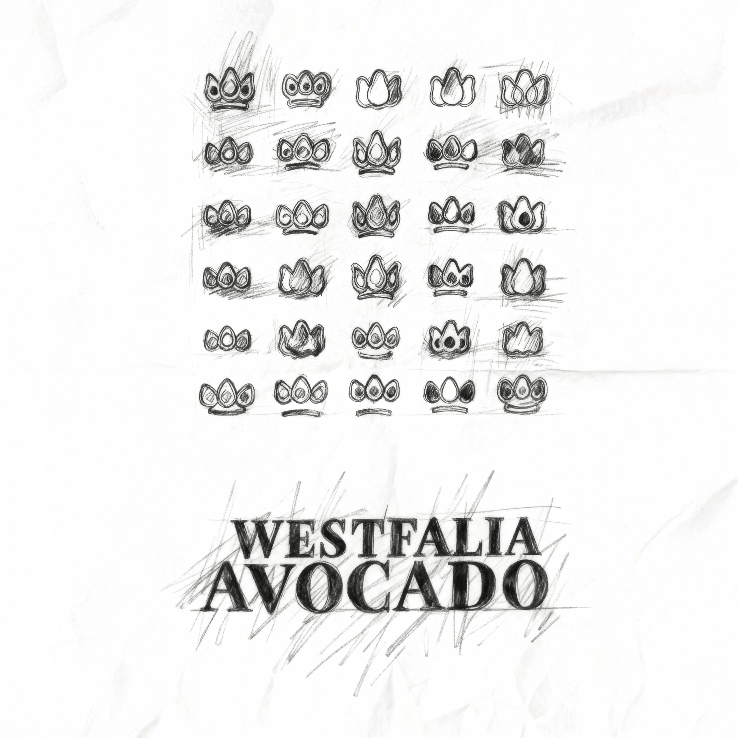
Logo and typography refinement — Refined logo and typography exploration balancing readability with a more distinctive, elevated brand presence.
Packaging design system — New packaging architecture with clearer hierarchy, stronger shelf impact, and a more sophisticated visual structure.
Color palette — A refreshed palette drawing from natural avocado greens with more refined accents to support premium food positioning.
Label architecture — Reorganized information hierarchy helping consumers understand the product quickly while giving the design a more polished shelf read.
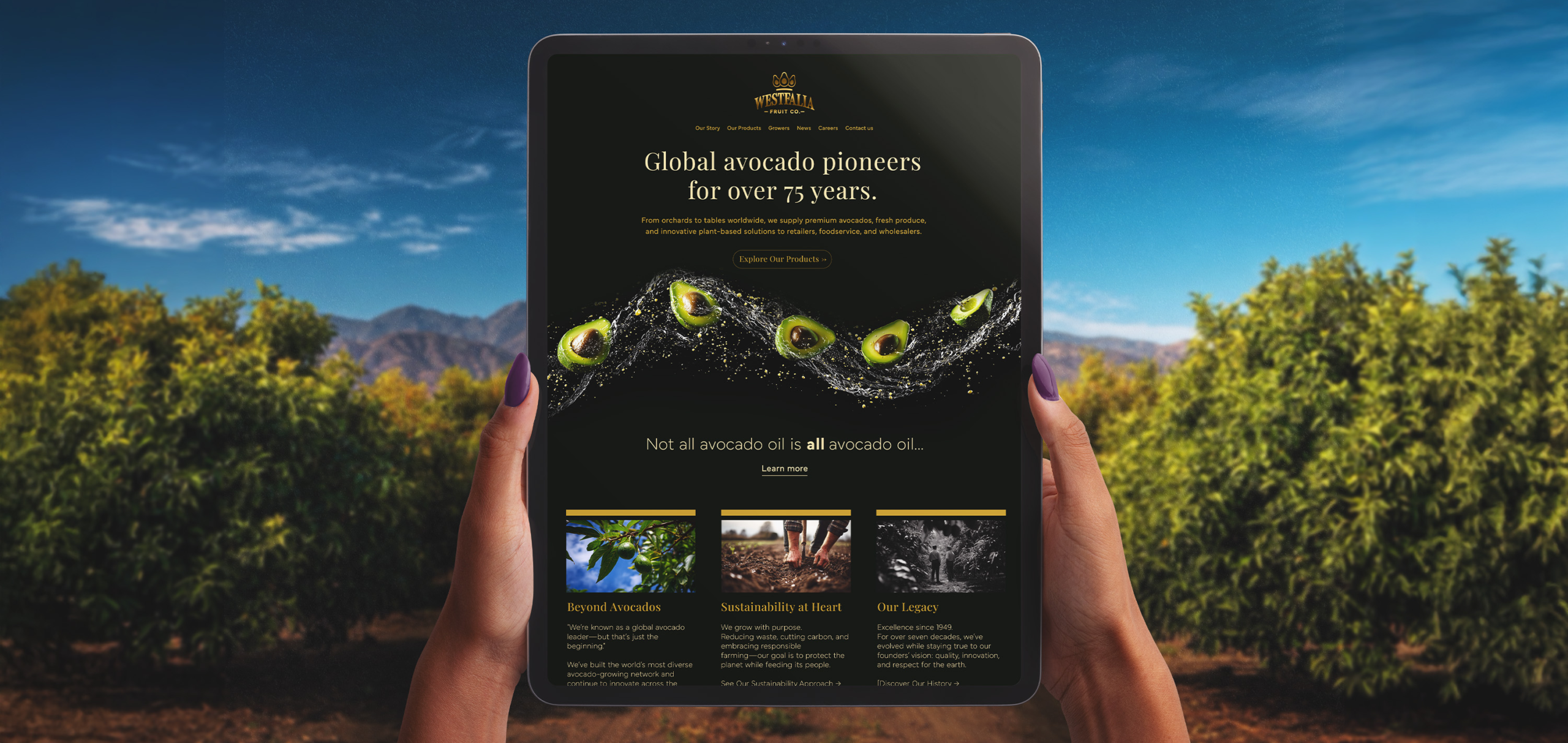
Brand applications — Identity system extended across packaging, promotional materials, digital touchpoints, and in-store applications.
Production-ready artwork — Final packaging artwork and delivery prepared for real-world use across consumer product surfaces.
Why it worked
The redesign worked because it made the product feel more aligned with its own quality.
Premium packaging does not always need to shout. Often, it needs better control: a cleaner hierarchy, stronger typography, more intentional color, and enough restraint to make the product feel worth picking up.
For Westfalia Pure Avocado Oil, The Refinery created a brand identity and packaging system that helped the product feel more sophisticated, natural, and shelf-ready. The updated design communicated purity and quality while giving the brand a clearer presence in a competitive premium food category.
A better bottle for a better pour.
Project Details
Client: Westfalia Fruit Co.
Brand: Westfalia Pure Avocado Oil
Assignment: Redesign the brand identity and packaging for a premium avocado oil product
Project scope: Brand identity refresh, logo refinement, packaging design system, typography, color palette, label architecture, visual hierarchy, promotional applications, production-ready artwork, and final delivery
Market: Consumer packaged goods / premium food and beverage
Primary capability: Brand identity and packaging design